Use Flying Blue Miles for day-to-day life
B2C MOBILE APP
COMPANY
ROLE
UX Designer
FIELD
Travel
YEAR
2020 (4 months)
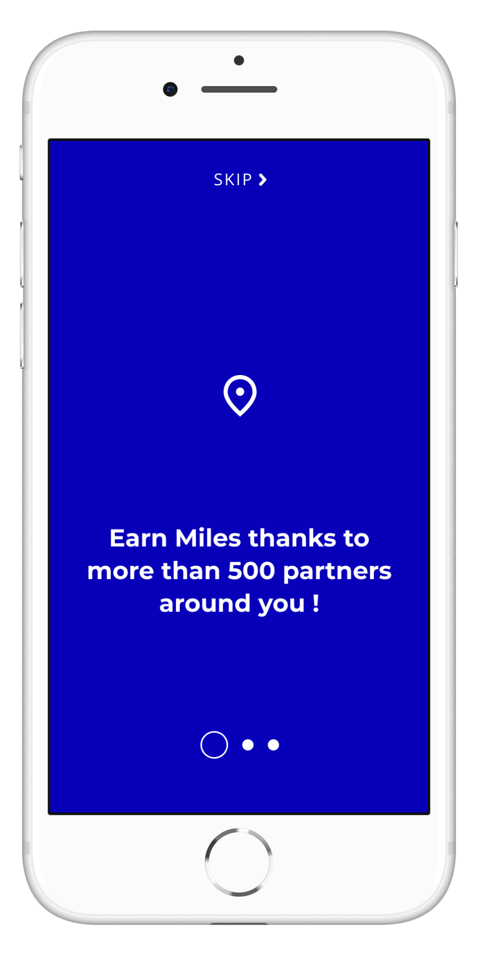
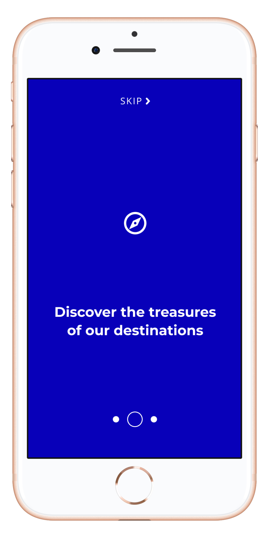


Quick summary
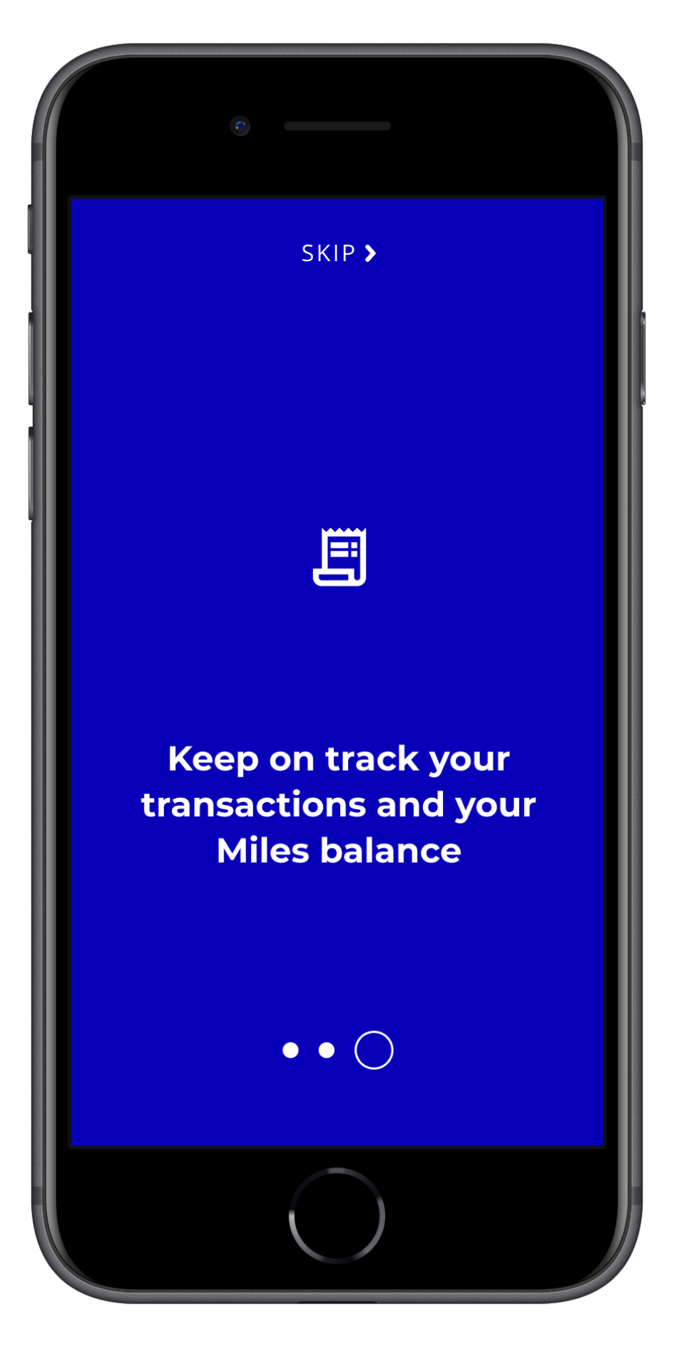
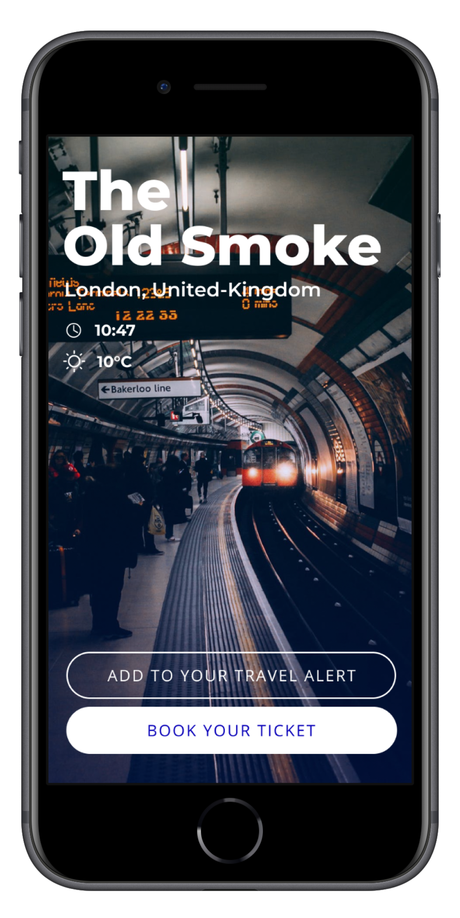
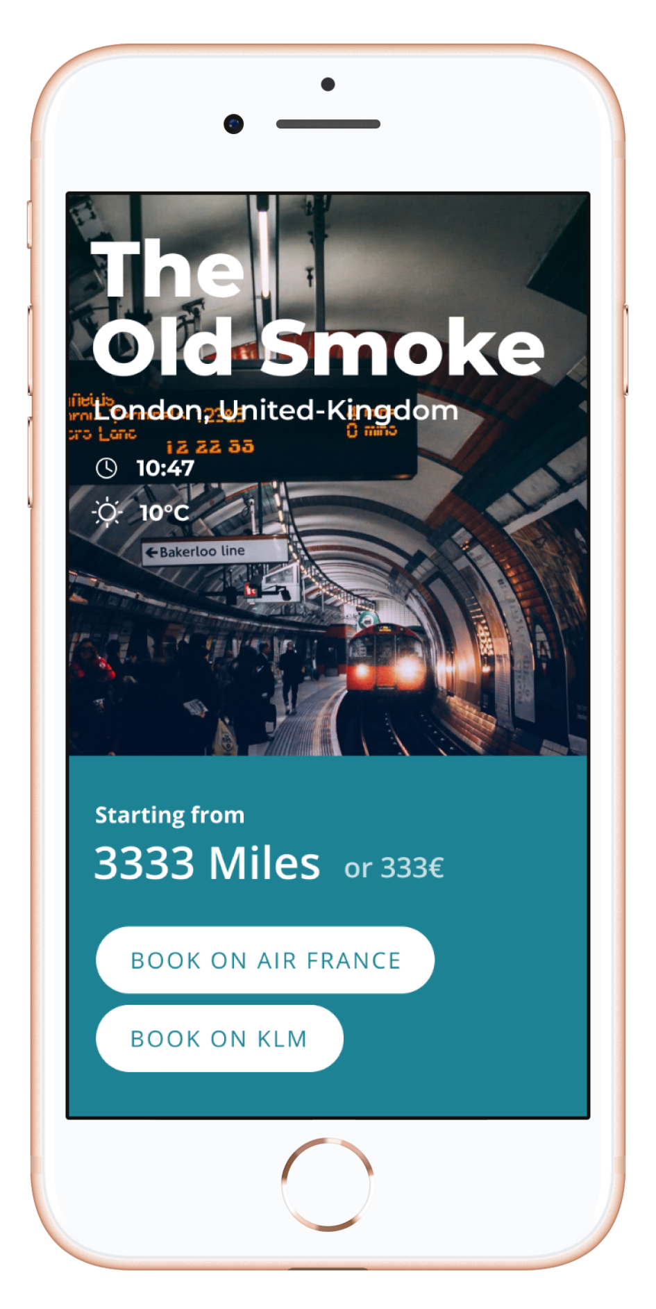
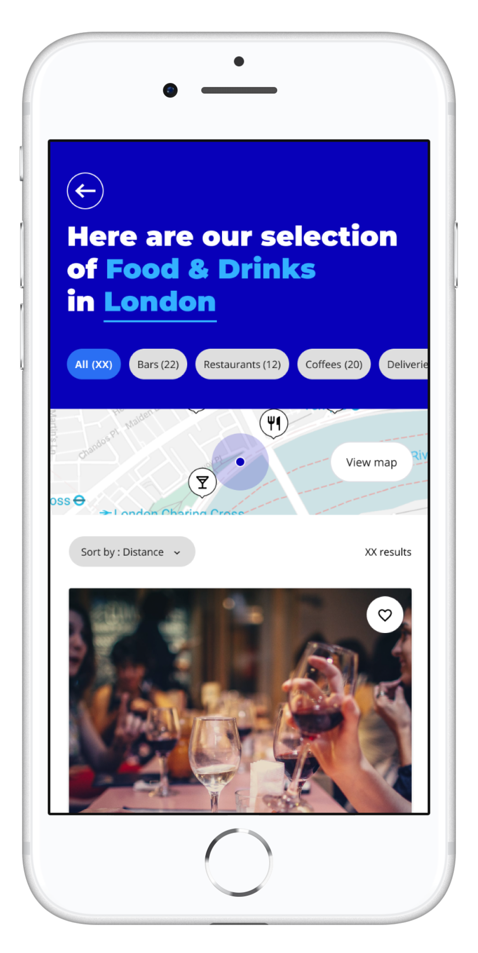
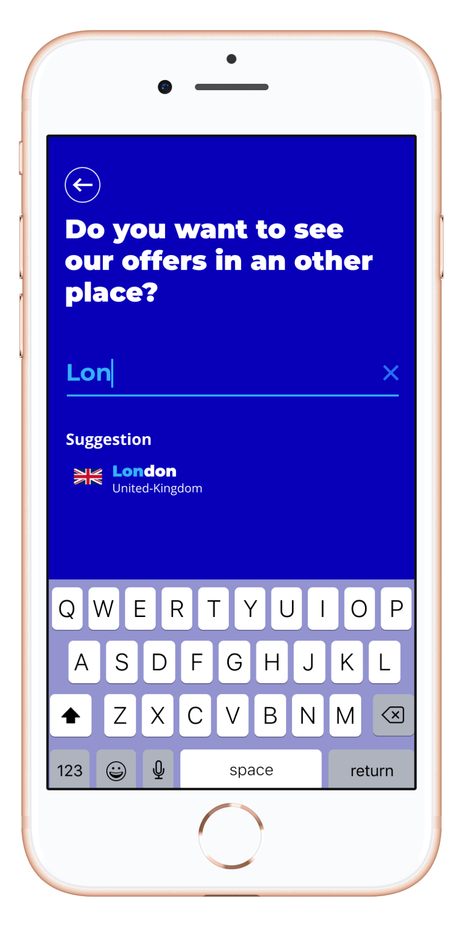
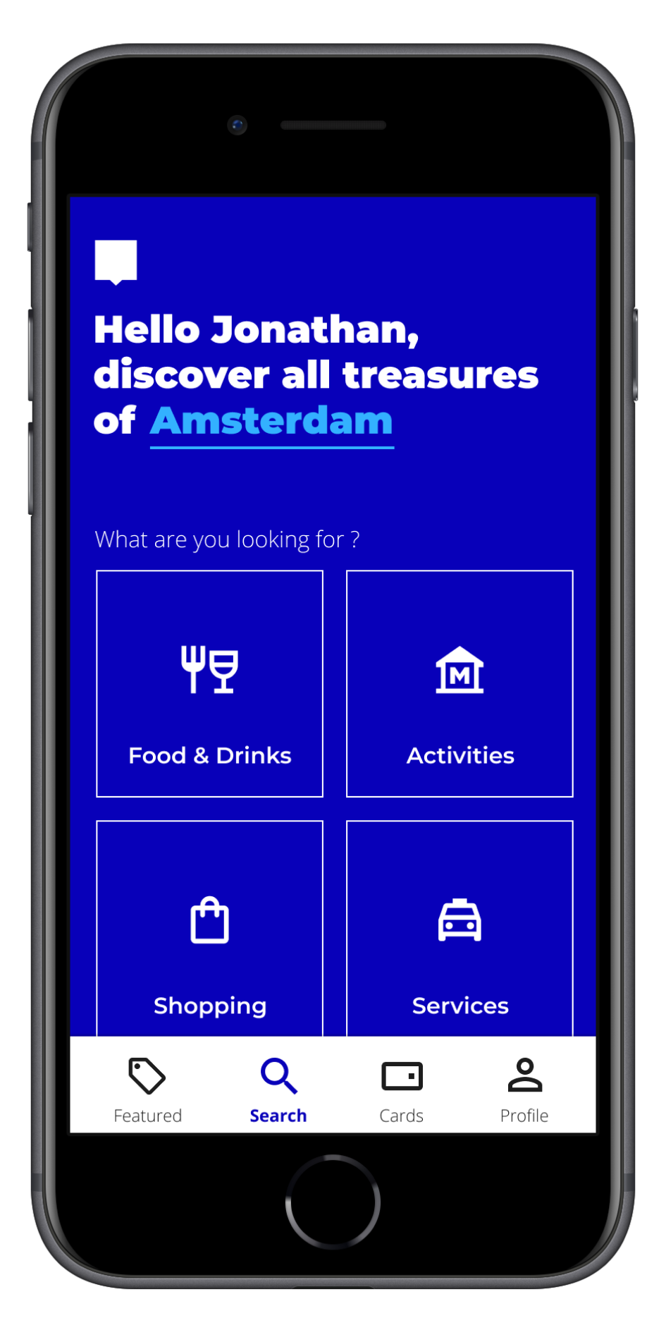
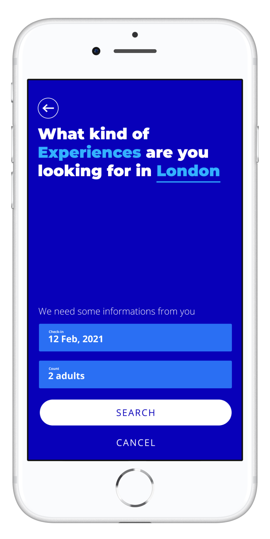
At Isobar (dentsu creative), I worked as a UX Designer for Air France-KLM's Flying Blue loyalty program. During the 2020 COVID-19 crisis, travel restrictions prevented members from using their accumulated Miles. Our solution was a mobile app allowing members to spend Miles in everyday situations, providing value when travel rewards weren't available.
During travel restrictions, Flying Blue needed alternative ways for members to use their Miles while preserving loyalty benefits. The goal was to maintain partner relationships and strengthen brand presence.
After conducting an audit of the initial work, we redesigned the experience to align with brand identity, creating a geolocated platform specifically tailored for Flying Blue partners and members.
+20
Pages were missing in the initial prototype
Remote first
The mission was handled async and in English.
100%
Full client approval; development began immediately
Flying Blue Pay
Flying Blue is the frequent flyer program of Air France-KLM, offering members the opportunity to earn and spend miles for flights and other rewards. In 2020, the big problem it faced was the severe impact of the COVID-19 crisis, which drastically reduced air travel and disrupted member benefits.
Overview
Objective
Develop a mobile app that enables Flying Blue Members to use their Miles within the partnership ecosystem, organized around an interactive map and payment functionality.
Key benefits
- Try new ways to use Miles in everyday life.
- Help members access benefits during travel restrictions.
- Highlight our wide network of partners.
- Show our commitment to members even in difficult times.
Discovery
To understand and design the ideal experience, I facilitated several workshops with business teams in both France and Romania. These sessions helped me grasp their current position, reasoning behind previous decisions, and how we could best support their goals. This discovery phase resulted in:
- PPOD (Project Point Of Departure)
- Branding & UX audit
- Application map
Solution
Using Figma, I designed a mobile interface that inspires and motivates Flying Blue Members to engage with our partner ecosystem and prevent their Miles from expiring. Deliverables included:
- Sitemap
- Screen Flow Maps
- UI mockups
- Interactive prototype
Results & Added Value
- We successfully delivered a functional mobile application that effectively represents the Flying Blue brand to its members.
- The solution helped loyalty program members utilize their Miles instead of losing them during travel restrictions.
- The app also maintained Flying Blue's valuable relationships with its partner businesses.
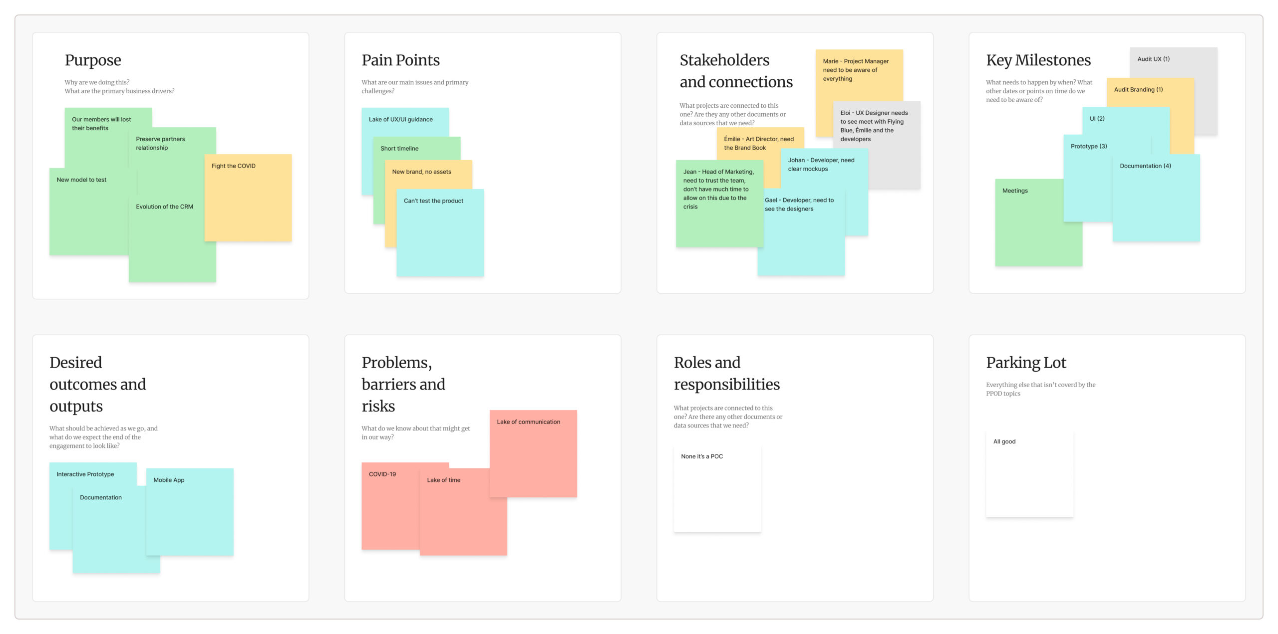
PPOD
Since we weren't the first team to tackle Flying Blue Pay, we needed to clearly understand the project expectations and limitations. To properly frame our work, we used the project point of departure framework.
Audit : Brand & UX
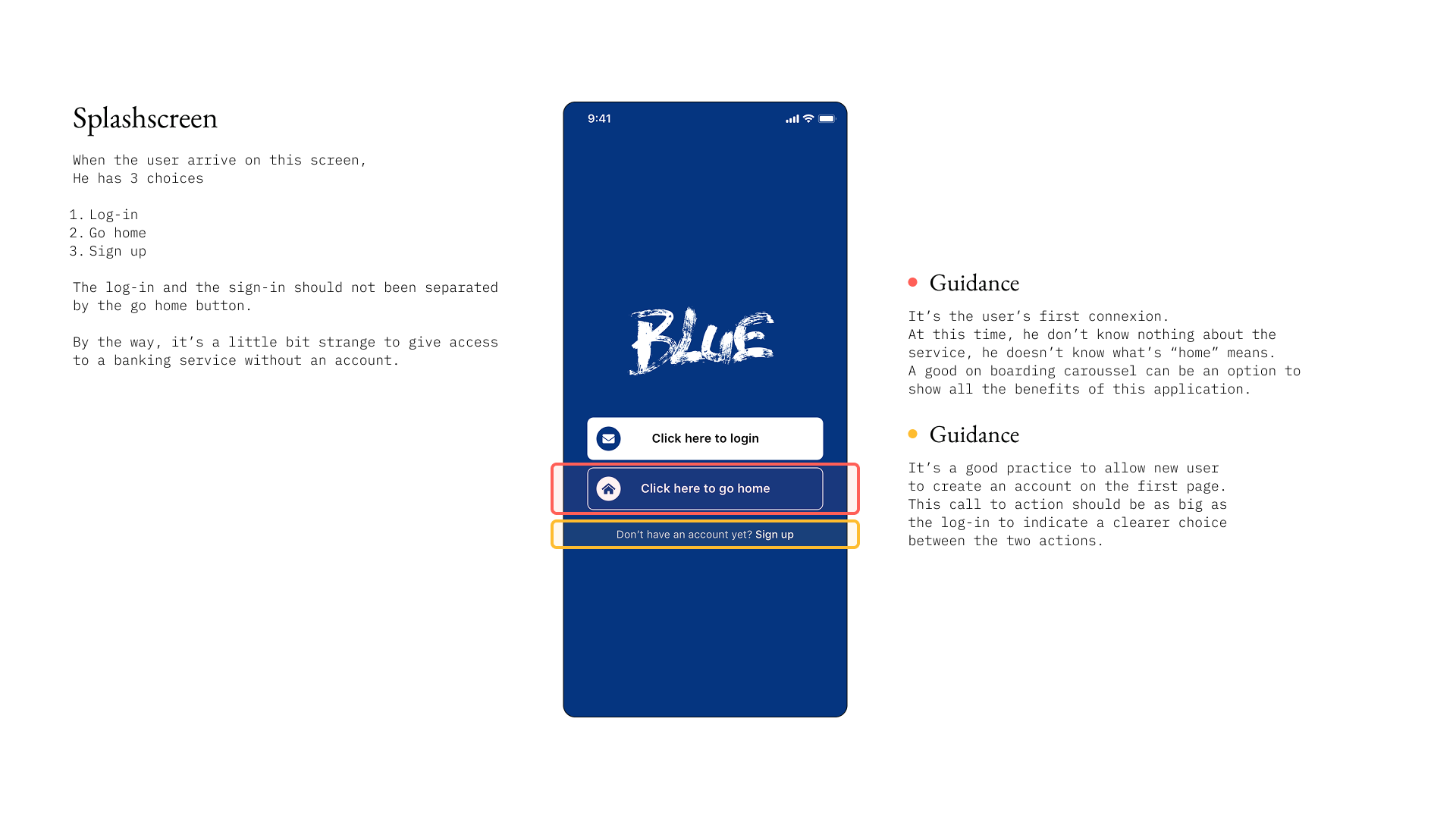
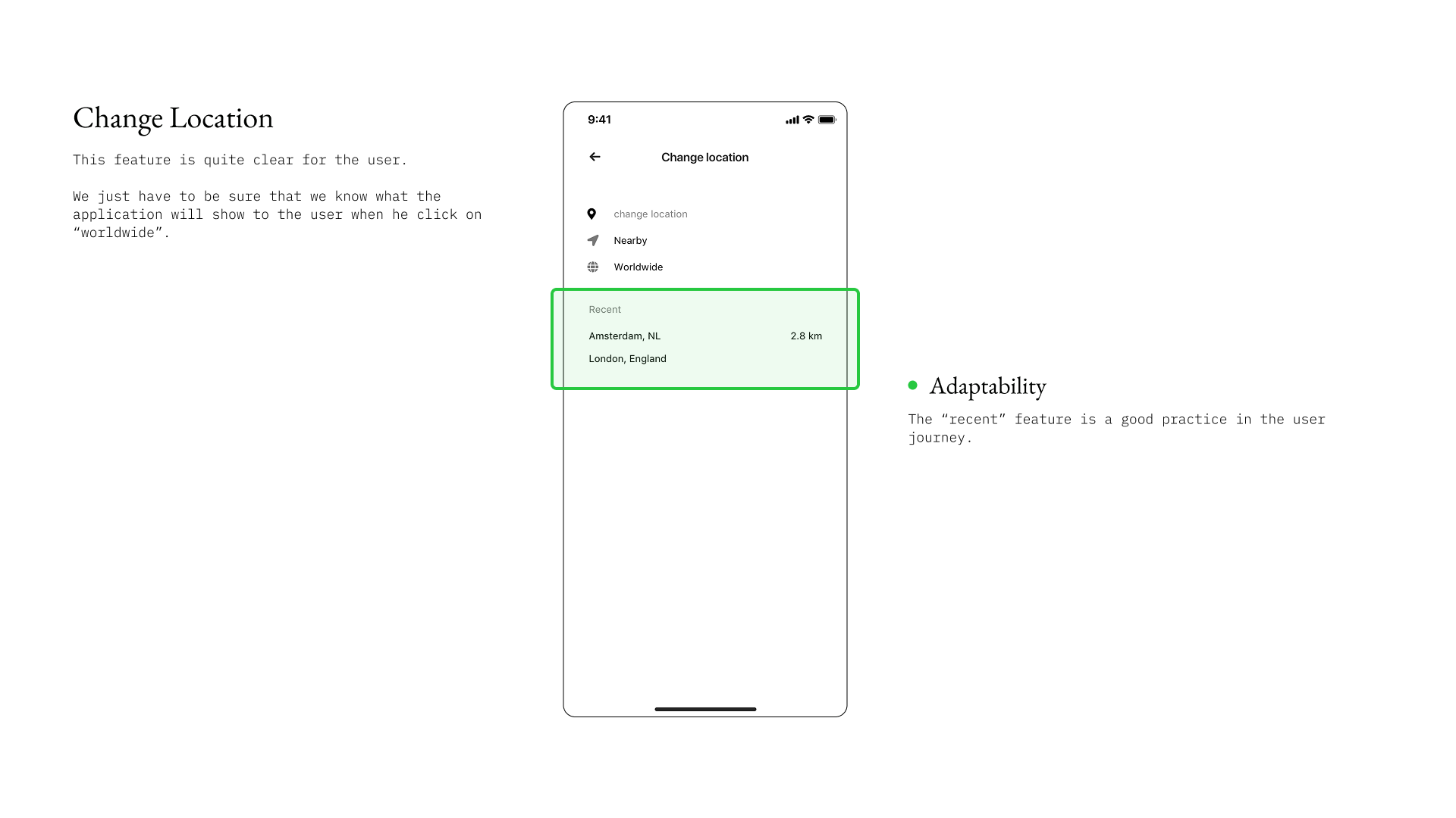
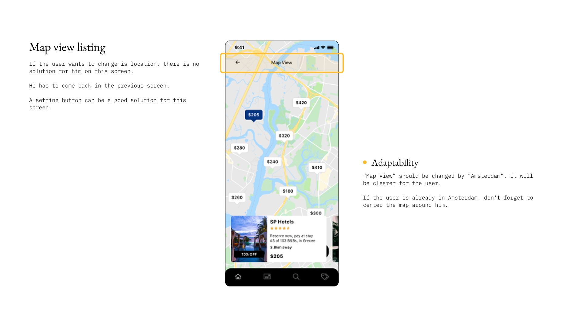
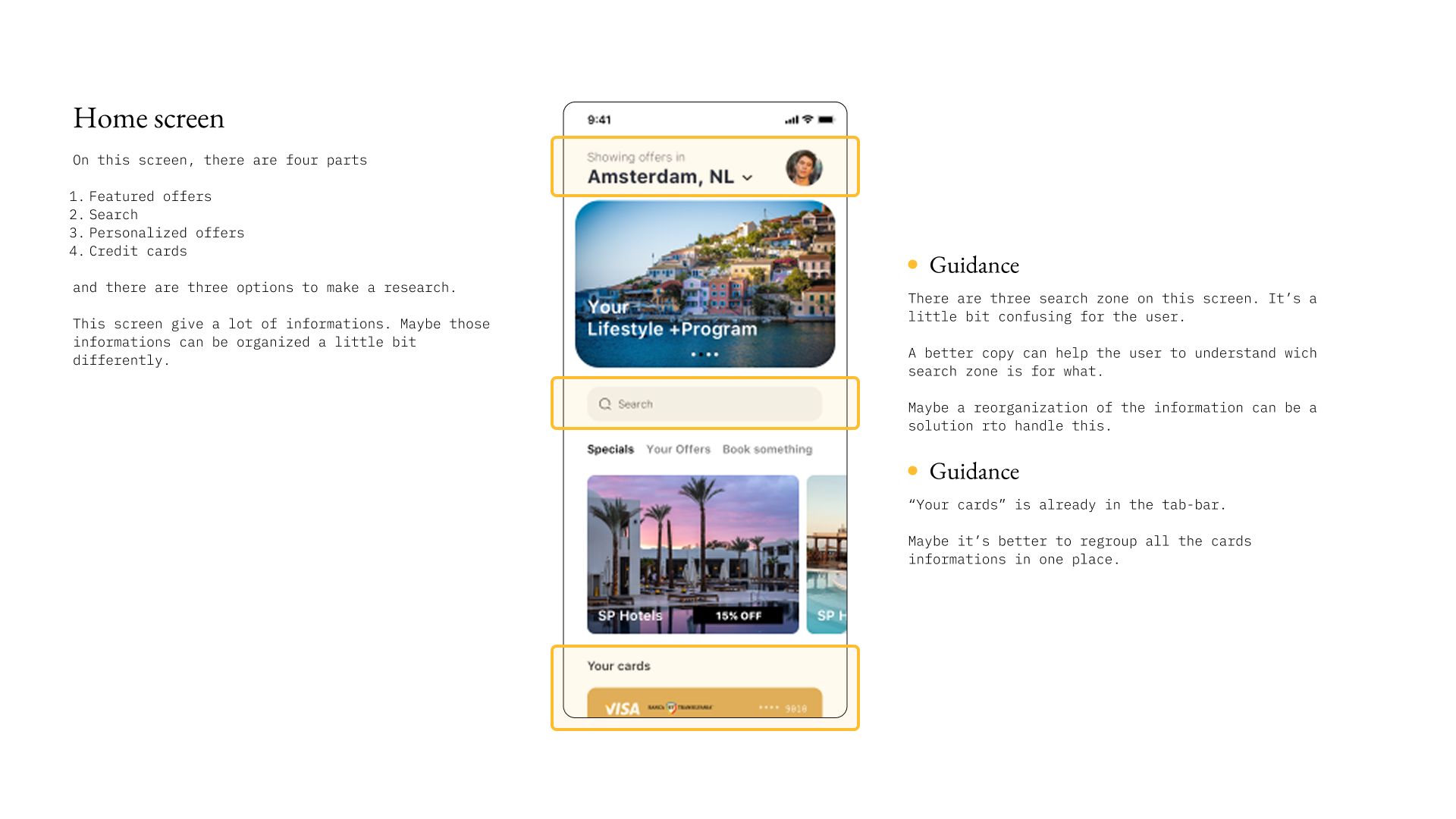
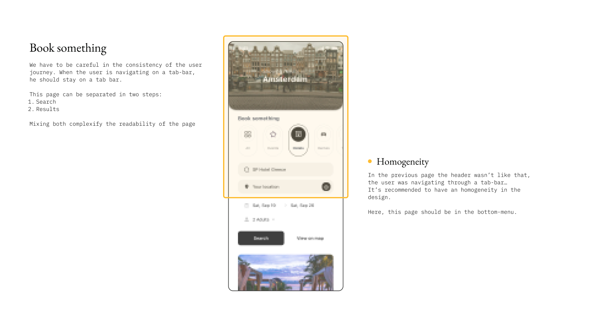
I conducted a thorough review of the existing screens and identified key usability issues using Bastien & Scapin's ergonomic principles.Meanwhile, Émilie, the Art Director, evaluated the visual elements (colors, logos, and wording) to determine why the app failed to integrate seamlessly with the Flying Blue ecosystem.
For stakeholder approval, I used the Bastien and Scapin framework to identify usability issues, inconsistencies, and interface problems in the existing design.
Selected criterias
App map
To ensure comprehensive functionality and coherent organization in the mobile payment application, I mapped out the detailed architecture and streamlined the previous team's initial proposal.
My sitemap consolidated the content into three main sections:
- Offers (containing all Flying Blue partners' offers),
- Cards (presenting different payment options),
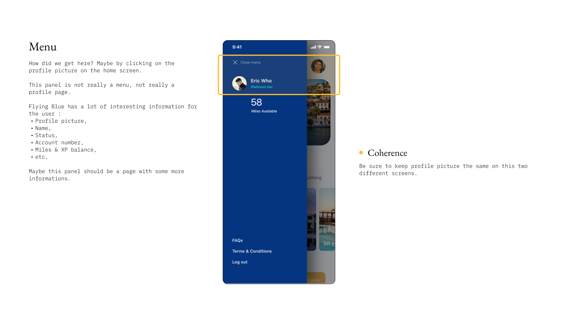
- Profile (housing essential personal information).
Screen Flow Map
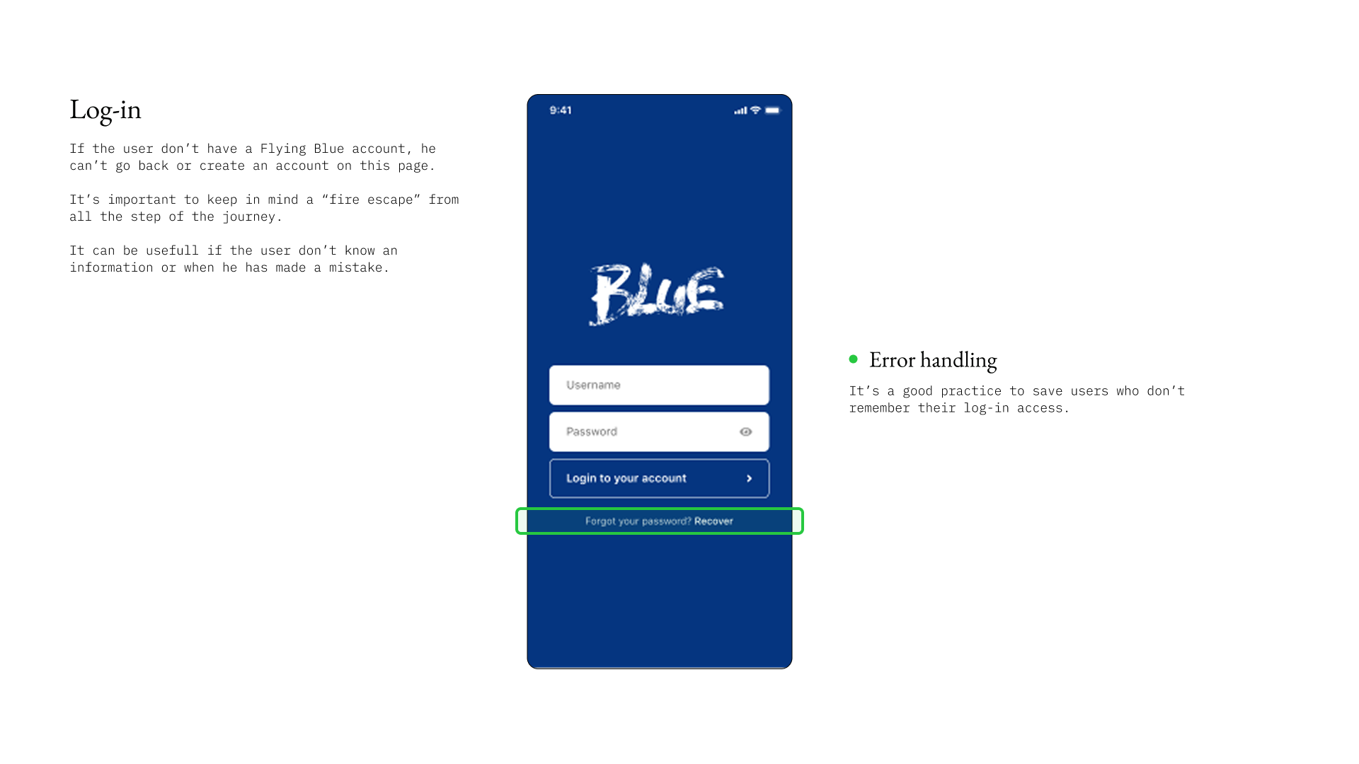
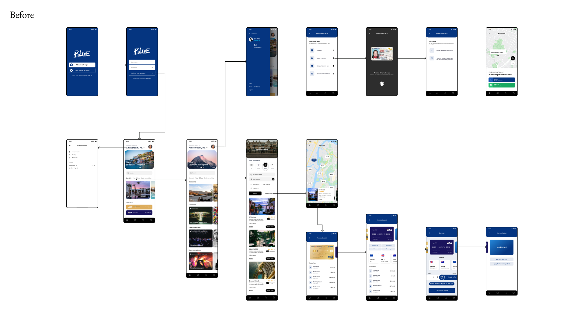
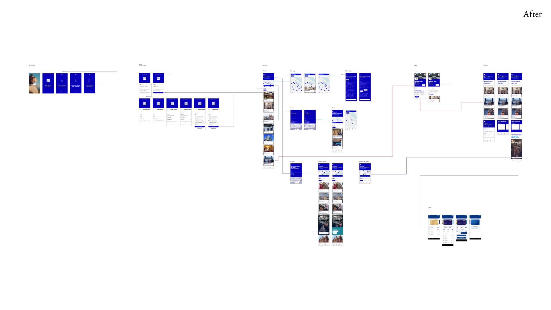
The initial version of the screen flow maps was missing many critical steps, making it difficult to visualize the complete user journey. Our revised version incorporated all the essential flows that were previously omitted, including login processes, card management functionality, and payment confirmation screens. We meticulously mapped out every interaction to ensure a comprehensive and seamless experience.
Prototype
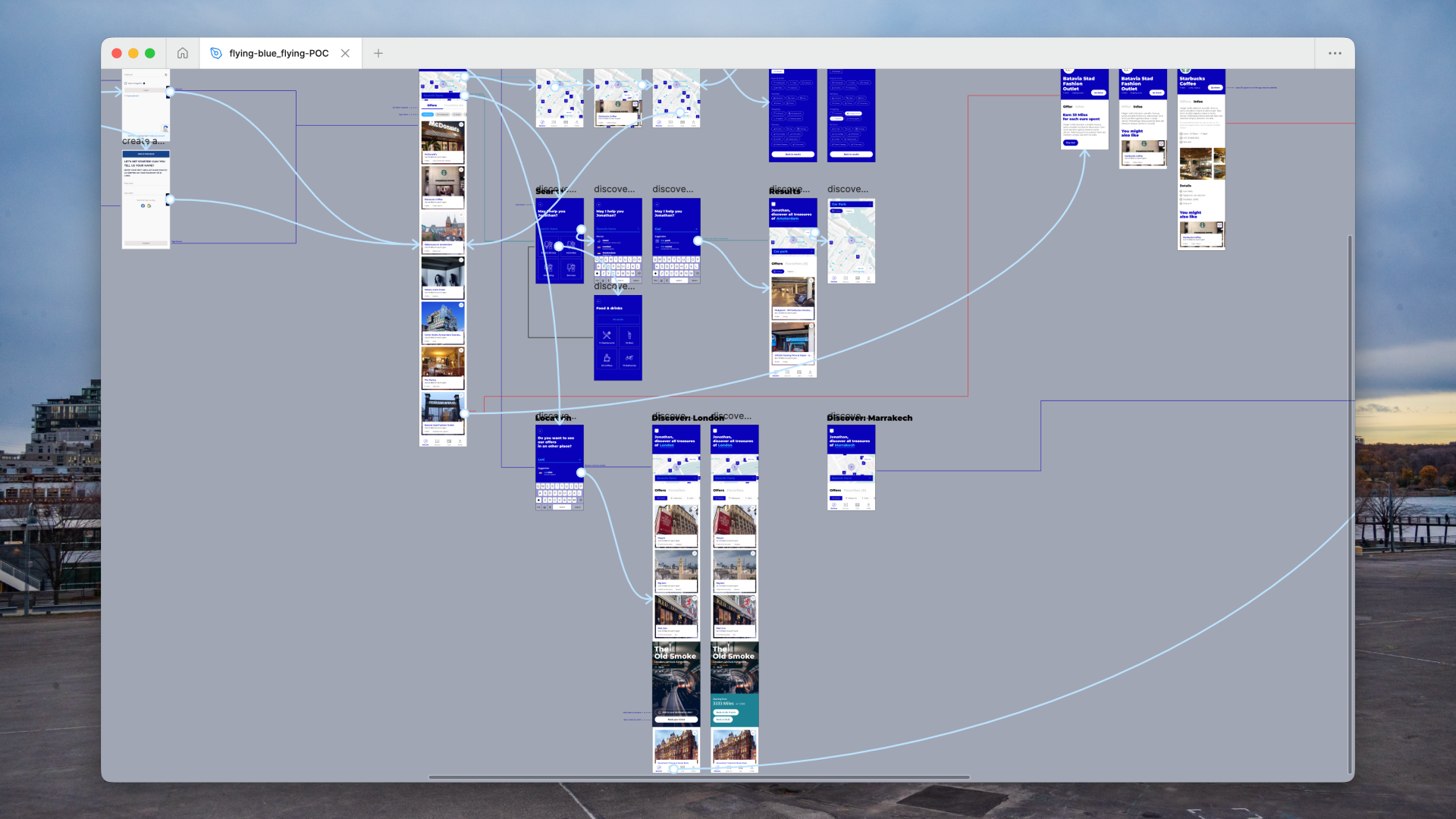
To clearly onboard developers and ensure we didn't miss any steps, we created a quick prototype. This allowed engineers to visualize all animations and functionalities, reducing friction during handover. It also helped secure full buy-in from our Flying Blue client.
In this project, I took over the proof of concept from a former agency, refining it for Flying Blue. I led the ergonomic audit using Bastien & Scapin's principles and supported the brand audit to ensure proper integration with Flying Blue's brand system.
I restructured the application architecture into three intuitive sections and created comprehensive screen flows addressing previously missing steps.
Under the Art Director's guidance, I designed high-fidelity interfaces aligned with the new brand identity, emphasizing clarity and accessibility.
My interactive prototype secured client buy-in and facilitated smooth developer handover. Successfully presenting our work in English and managing the transition to the Romanian development team resulted in 100% client approval and immediate development commencement of a POC that helped shape Flying Blue's partner relationships during travel restrictions.
Let's work together
We'll begin around a call to understand your expectations and the problem we've to solve.
Eloi Motte
UX & Product Designer
Discover
Other websites
